Here is a photo of the finished banner from a sneak peek of our engagement shoot, by the amazingly talented Dan Simmons!
Tuesday, March 29, 2011
Thursday, March 24, 2011
Save the Date Banner
Yesterday Tony and I went to have our engagement photos taken. Normally I wouldn't feel like spending money on them, but 1) I wanted to see how this photographer's work looks because he usually works in still life, 2) I want Tony and I to be comfortable with him shooting us since he might be covering our wedding, and 3) I decided to use one of the photos as our Save the Date.
So I decided to make a banner with our wedding date on it, that way the front of the Save the Date is a photo of us with the date needing to be saved. And because I finally charged my camera and got a new laptop, I decided that a tutorial was in order.
First order of business was to decide the font for the numbers and print them out on regular computer paper. I also chose thick cream-colored cardstock for the flags, since the banner I decided to make were pennants strung on a ribbon, and a light green 5/8" ribbon.
I considered a few different ways to make this. I could trace the numbers onto a darker cardstock and then mount them to the pennants, or print them out directly onto the light cardstock. I decided to trace them out and paint them in. It was going to be meticulous no matter how I did it, but this way gave me more control over the final product. This meant cutting out the numbers, which was slow-going.
After I cut out the numbers, I cut the sheets of cardstock into the triangular shape. I had to play around a little bit with the actual shape so that the size and shape of the numbers looked right. I then positioned the number and traced it out. I would highly recommend securing the number down, I just held it and tried to keep it lined up. It worked fine and turned out right, but it was a huge pain.
Choosing a paint color was a weird process. I tried to decide what matched with the rest of the wedding stuff (the invites specifically), then I looked at colors that would look nice outside since we were going to take pictures at Golden Gate Park. I eventually realized I was over-thinking it and just picked a color that I had enough of.
Once I finished painting them (and redoing a couple that I messed up) and letting them dry, I glued them to the ribbon and voila! I don't have photos of the finished product (after hours of tracing and painting, I was DONE), so you will just have to wait until we get the engagement photos back, sorry!
Sunday, March 20, 2011
Lazy Days
My days off have been few and far between. So when I do get a day off, I tend to catch up on sleep, and then spend the rest of my day zoned out in front of the tv in my pajamas. It's nice, and very necessary, but it's getting old. If I am barely ever off, then I don't want to waste that time by tuning out. We need to get out of the house and explore!
Maybe we should take a day trip out of the city. And have a picnic. While snuggling up in cozy blankets.
Now if only it wasn't going to rain for the next two weeks.
Maybe we should take a day trip out of the city. And have a picnic. While snuggling up in cozy blankets.
Now if only it wasn't going to rain for the next two weeks.
Friday, March 18, 2011
STD's
Ok so I came across this video in my blogland wandering, and I can't figure out whether I want to laugh or shake my head. It's a dramatic reading of message board posts about polar bear stamps. And how bitchez be crazy, basically. While I can definitely appreciate a comedic take on how ridiculous the wedding industry can make us, when every little detail seems like such an end-all be-all, it really makes me wanna slap a lot of brides out there right across their pretty little faces. (Please don't get offended, I can also see this as a very valid point of discussion based on trying to make the details of an incredibly important day come together, which is why I have mixed feelings about the video and am writing about it in the first place.) Still, it's a pretty funny video, especially when you can recall having read comment threads exactly like this. Let's just say yay for a woman who isn't afraid of being a little silly!
Obviously, usernames have been changed.
Monday, March 14, 2011
Les fleurs
I've never been a flowery girly girl, but the more I grow up, the more I really appreciate flowers. There is absolutely nothing bad to say about flowers. They are pretty, they smell nice (some more than others), the can brighten up a room, your day, your event...
Needless to say, I'm up to my eyebrows in floral inspiration pics. I think the flowers are the easiest way for me to picture the style and colors of this wedding coming together, so I have definitely been gravitating towards floral inspiration as of late.
This first one is my ultimate favorite (so far). I am head over heels for black and white anemones. They are without a doubt making an appearance in the wedding somewhere (more likely everywhere). But I love how the graphic high contrast of the anemones looks with the soft pinks and grey dusty miller in this arrangement. I like to think I can recreate this look, but a test run sometime this summer will prove whether or not I am correct in that thought process.
Maybe I will forfeit and just stick with anemones and some greenery. If that's all it takes to make this bouquet happen, I will be a happy little camper.
Or maybe I will go the other direction and amp up the pink flowers and use anemones as an accent. I love these pink dahlias... the first word that comes to mind when I see dahlias is architectural, which I am definitely alright with, because they really are just cool looking flowers when it comes down to it.
The other big fluffy flower option would be peonies. They definitely win the blue ribbon for "big ruffly wedding flower" and they would fill up a bouquet quickly, so I wouldn't need to get as many. But that big blossom comes with an equally big pricetag, so maybe not. (I like the peach garden roses in these arrangements though.)
Roses? Never been a huge fan, they are easily overdone. However I cannot get enough of the color of these particular roses. I can't figure out if they are pink or purple or what, but I totally dig it. If anyone knows what kind of roses these are, please please please let me know.
Well, that's all for now!
Love.
Wednesday, March 2, 2011
Inspiration at its finest
I'm really start to crack down on figuring out exactly what our wedding will entail. I've been making all sorts of extremely detailed spreadsheets for the budget and the breakdown of all the different ideas we have. Since we are paying for this wedding ourselves, and we aren't exactly rolling in cash, I want to make sure that we don't spend unnecessary money on things we realized weren't important. I mean, food is important, the bar is important, but an aisle runner? Absolutely not.
That being said, in trying to figure out what we want, we have started trying to really figure out the style of this wedding. It is going to be in a backyard during the summer, but I don't want a super casual affair (but on the other hand, neither one of us are formal people). I love color, but I am obsessed with neutrals and then stick with bolder accent colors. We love the outdoors but aren't really outdoorsy people. Maybe we are difficult. Maybe we don't really know our personal styles yet (though I disagree, seeing as we have been pulling together a very lovely apartment, with photos to come soon). I like to think it is because we are both Gemini, sign of the twins, and sign of balancing/contradicting ideas. Example: I either want to live in the middle of a bustling city or out in the middle of the woods, completely off the grid. Nothing in the middle sounds good.
Despite the overwhelming amount of inspiration out there (and it's all just so damn pretty!), we have managed to narrow down our ideas. These are three of the many inspiration boards out there that best suit our tastes. They are all completely different from one another, but I am determined to somehow incorporate all three styles, color palettes, themes, etc. I know I have probably bitten off more than I can chew here, but I'm stubborn. And I prefer to think of it as ambitious.
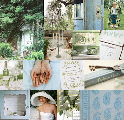
The first one is the main feel. We both love the idea of the Secret Garden theme. All the natural and overgrown greenery, little vintage touches like rusted skeleton keys and stacks of old books, the formal touches like the chandelier offset by a casual setting... *swoon* I'm sold. In fact, I'm so sold that I have already started hunting down old keys and books on ebay and scouring the local vintage shops for tarnished silver centerpieces. Super fun, by the way, I am loving it. I might not be about to wear a big floppy white hat on my wedding day (though I have nothing against it, just isn't my personal style), but I had pretty much found the inspiration board that had exactly what I wanted, all inclusive.
Until I saw Inspiration Board #2. Now, anyone who knows me, knows that I would give my right foot to live in Paris, so a romantic, luxurious, dramatic take on my favorite City of Lights got me right in the gut. If ever I was to embrace pink, this would be it. The playful pink offset by sophisticated raspberry and all alongside that moody charcoal makes my heart pitter-patter something fierce. So how can I just brush it aside? I can't. I'm thinking the colors will lead the way for the bridal party and flowers. Romantic gray dresses for my girls, with peachy-pink bouquets and pops of burgundy... hm, somewhere, not sure yet. But I am determined to make it work.
Now Board #3 is really more of a general guideline. The blue isn't quite my shade and I have no particular attachment to Mississippi. What I like about it is that it has a distinctive vintage flair without it being a "theme." It's more like a vintage take on understated elegance. Not to mention both Tony and I love magnolias. If I could find them on wholesale somewhere, I would have them be my bridal bouquet. I can't seem to find them anywhere though!
I think everything will go together fairly well, and keep in mind I have a more detailed picture in my head. But I would still love to hear any opinions or thoughts. Or ideas! Let me know!
Subscribe to:
Posts (Atom)